|
An alternative introduction to image processing or How to turn your holiday snapshots into |
by Richard Grant
One of the pleasures to be had after returning from holiday is going through all those pictures you took. You may just want to revive some happy memories or perhaps you have been invited to give a talk about your trip to a local club or group of friends and you need to select some pictures to show them. As you review them, do you sometimes realise that a picture could be improved? Perhaps it is too dark overall, or the colours of that fabulous sunset have washed out because the camera got the exposure wrong. You might realise that the composition would be a whole lot better without the bit of window frame on the side, or that the horizon of your beach scene is not horizontal. What a pity about those telephone wires spoiling a wilderness scene or the red light in your partner’s eye from the flash photo of your special dinner. Maybe the picture was taken in artificial light and has a yellow hue. You would like to put these things right and may know that you can do it with image processing software such as Photoshop and Lightroom but they are complex and difficult to use, and expensive! You might have downloaded the free trial and found yourself overwhelmed by the number of features offered by these complex programs.
If any of this sounds familiar, then this article is for you because it will explain how you can turn your latest collection of holiday pictures into a show that will be appreciated and enjoyed, using software that is easy and free to use. In these days of digital photography and computer-based image processing it’s a remarkably simple and satisfying thing to be able to do.
I don’t claim to be an expert photographer but very few of the pictures I show to my friends are exactly as they came out of my camera. Making attractive images out of my snapshots is simply a creative and satisfying exercise for me. So here, for what it’s worth, is how I do it.
To start with, I take fewer pictures than I used to! It’s so easy these days to come back from a trip with literally thousands of images but it wasn’t always so. It is difficult to believe that not so long ago we would go on holiday with just one new film in the camera providing 36 exposures (or 37 if you loaded the film in the dark in order to squeeze one onto the film leader!) Then after waiting for the prints to come back from the lab you would select maybe 20 for the album and still produce a comprehensive and treasured record of your trip. In his wonderful bestseller “The Art of Travel” Alain de Botton has some wise words to say about why we take pictures when we go on holiday and the appreciation of art in general. He proposes that each picture we select to show to our friends should tell a story and/or cause the viewer to feel some of the same emotions the photographer felt when they were inspired to record the scene. It’s really good advice as a selection criterion and I now find myself doing far more looking, seeing and appreciating when I am travelling, and coming home with fewer and better pictures as a result.
Let the camera do the work! If you have been bracing yourself for a lecture on aperture, shutter speed, depth of field, ISO etc. you will be disappointed because you won’t find it here. The automatic adjustment mode on modern digital cameras is so good that for 99% of the time it will get the focus and exposure right enough for a good picture all by itself and you won’t miss that fleeting shot. Understanding and adjusting camera settings is important but it is up a level or two from this article.
Display the histogram on the camera viewing screen. The histogram is your friend. It may look complicated at first and even the word sounds like a scary medical procedure, but it isn’t. When you take a picture, the two main concerns at the time are that the image is in focus and the exposure is about right. The histogram is just a graph of the number of pixels in the image that are loaded with a particular brightness value. To understand the histogram, turn it on and point the camera at various scenes from a bright light to a dark doorway and lots in between. Watch what happens to the histogram. If the scene is dark and will be underexposed, the histogram moves to the left. If the scene is bright with bleached out overexposed areas, the histogram will shift to the right. So the histogram for a well-exposed image will be spread out along the horizontal axis without too much at either end. If there is a big vertical spike at the right hand end, there are lots of pixels with the full brightness value and no detail in the bright part of the image can ever be recovered. If there is a big spike on the left hand side, many pixels have the value for totally black and all detail is lost forever in the dark part of the image as well.
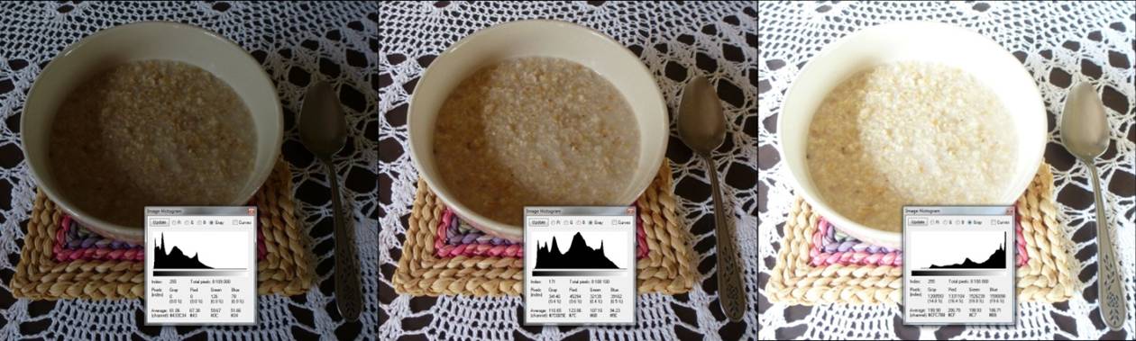
Too dark (underexposed) Just right Too bright (overexposed)
Image 1. Understanding the histogram
Only a few minutes of watching the histogram as you move the camera around will enable you to understand what the histogram is, and when it is nicely spread out around the centre of the horizontal axis you will know that the exposure will be about right when you release the shutter. Once you have the correct exposure, the image in focus, and your subject taking up most of the screen, you are 80% of the way to a great picture!
When you get home, the next step is to download the contents of your camera’s SD card into a folder on the hard drive of your computer so the fun can begin. But what software to use?
Choosing the image processing software
There are many books on image processing and the ones I have seen tend to promote the large commercial software packages such as Photoshop or Lightroom. These are wonderfully powerful and clever products but their size and complexity scares me to the extent that I don’t know where to start. I don’t want to swop people’s heads around or turn a grey sky into a sunny blue one, I just want to tidy up my pictures which generally involves some levelling, cropping, colour balance adjustment and maybe the removal of a power cable or red eye. Sometimes I will add explanatory text and an arrow or two. Finally I will size the image for a full HD screen. I can do all this and much more with a program called IrfanView which you can download for free from www.IrfanView.com or a number of mirror sites.
Why IrfanView? Because the program itself is a work of art! There appears to be some interesting psychology when it comes to acquiring software. Imagine you are buying a program to perform a task such as keeping accounts, word processing, image processing etc. and you have two options for the same price. One requires 300 MB of disk space and the other requires 500 MB. Which will you buy? Apparently many people would go for the bigger package, on the assumption that it must have more features. In reality the bigger package may just be an example of blundering and inefficiently coded “bloatware”. As I write the current version of IrfanView is 4.51. The download of the main program is just 2.4 MB! The plugins download is 15.8 MB. It installs easily, loads in an instant, runs like the clappers, is intuitive to use, and freeware for private use. If software can be beautiful, IrfanView is beautiful software. It is so small and fast that I use it as my image viewer. It is even possible to have several copies running at the same time in order to cut and paste from one to the other. It can also be installed on and run from a flashstick so when you are away from home in an internet café you will have it immediately available to process your pictures before you post them on the social media platform of your choice.
When I have all the pictures from my holiday in a folder on my computer, the next thing I do is a fairly ruthless weeding process. I delete all those images that are out of focus, duplicates or near duplicates, those that show nothing of interest, unflattering pictures of people or those that are heavily under- or overexposed etc. Generally this gets rid of about a third to a half of the original number.
Then I begin the process of improving my pictures and hopefully turning snapshots into attention-grabbing, visually appealing images. For the purposes of this article I will work with the picture below which has several obvious faults and by exaggerating the process of producing something better from it, I hope I will demonstrate the steps I take in an understandable way. In particular this article will show you how to: level the horizon; improve the picture’s composition through some judicious cropping; sort out the poor contrast and colour balance; size it for display on a full HD screen; get rid of unwanted artefacts such as the telephone cable across the sky; and embellish the picture with some text and arrows if necessary. Note that it is not the intention of this article to provided a step-by-step tutorial on how to use IrfanView as the program itself provides intuitive and context-sensitive help and levelling the horizon (or making some other feature such as a pole vertical) is simply done by selecting the Straighten/rotate tool in ‘Edit – Show Paint dialog’ and then using the mouse to draw a line along the horizon or the pole. When you release the mouse button, the image is suitably rotated. Image 2 below is a screenshot of the original picture loaded into IrfanView. The picture is at its original resolution of 3000 x 4000 pixels, as it came out of the camera.
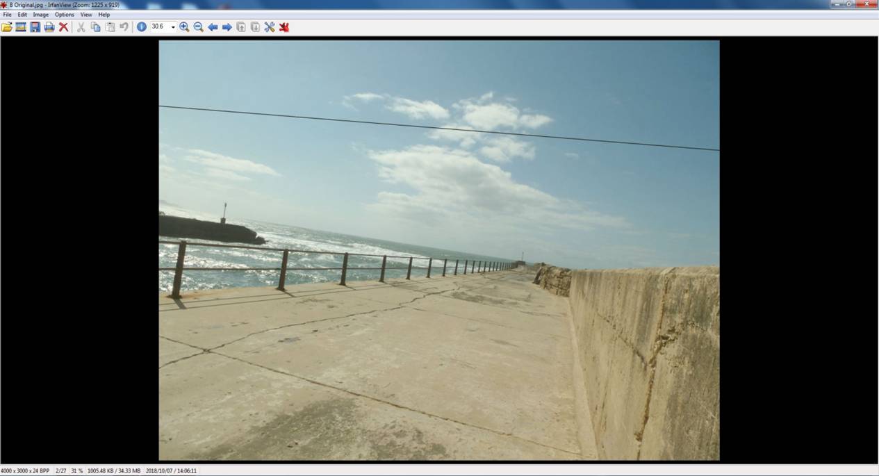
Image 2. The original image
STEP 1. LEVELLING THE HORIZON
Start the IrfanView Paint plugin from Edit menu. Select the Straighten/Rotate tool in the Paint dialog. Draw a line to set the correct horizon. See the blue line; it uses the sea level as the new horizon.

Image 3. Drawing the horizon
After levelling the horizon, the image will look like this.
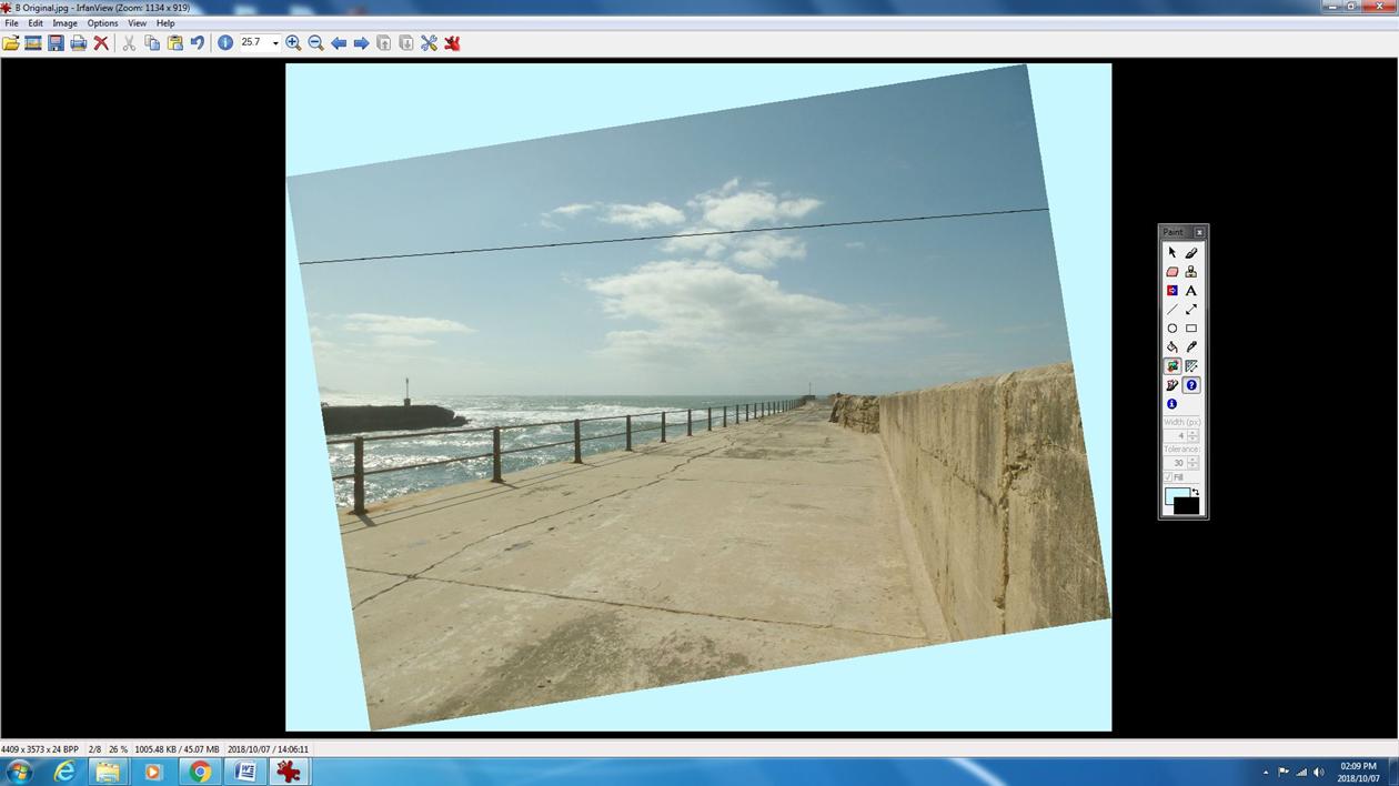
Image 4. Levelling the horizon
STEP 2. CROPPING TO IMPROVE COMPOSITION
Next I use the cropping tool so that the image will be square with the screen and contains only what I want. With the mouse I outline the area that I want to keep. I enable the ‘thirds’ grid and I watch the aspect ratio of my crop (at the very top of the screen), aiming for an aspect ratio of 1.777 which is 16 by 9, i.e. the same aspect ratio as a full HD screen.
Why the ‘thirds’ grid? An image often looks more pleasing when the focal point, or object that the eye is first drawn to, is placed about 1/3 of the way from the side, top or bottom – this is the secret to good composition. In this case, I think it’s either the angler or the end of the pier where the natural lines in the image seem to converge, so I placed the grid like this.
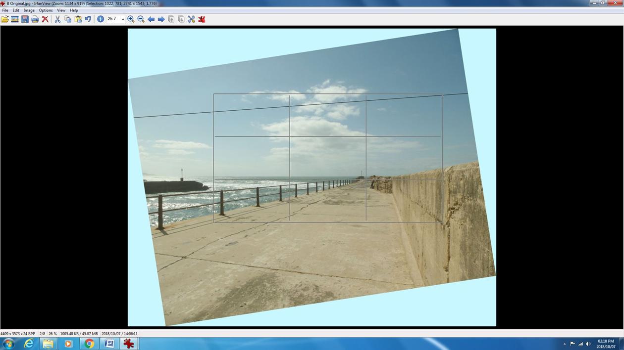
Image 5. Cropping
This is a fairly harsh crop but it centres the patch of cloud and will take out the end of the pier on the left which I think is a bit distracting. Of course, this is a highly subjective decision – you might think that the other bit of pier balances the picture nicely, but for the purpose of illustrating the process, let’s proceed. Make the crop with ‘Edit – Crop selection (cut out)’. Now the image looks like this.
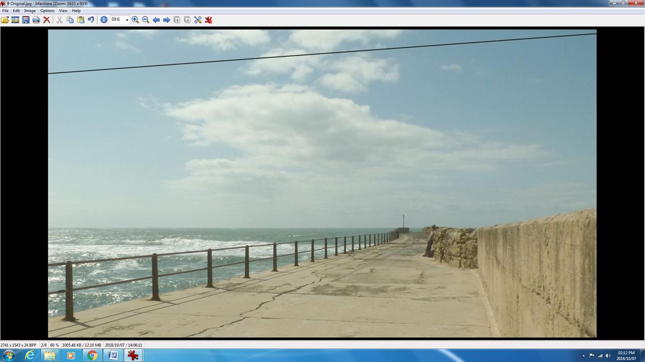
Image 6. The result of cropping
Step 3. Improving colour and contrast
At this point it is time to sort out the poor colour and contrast using the histogram. You will find it in ‘Image – Histogram’.
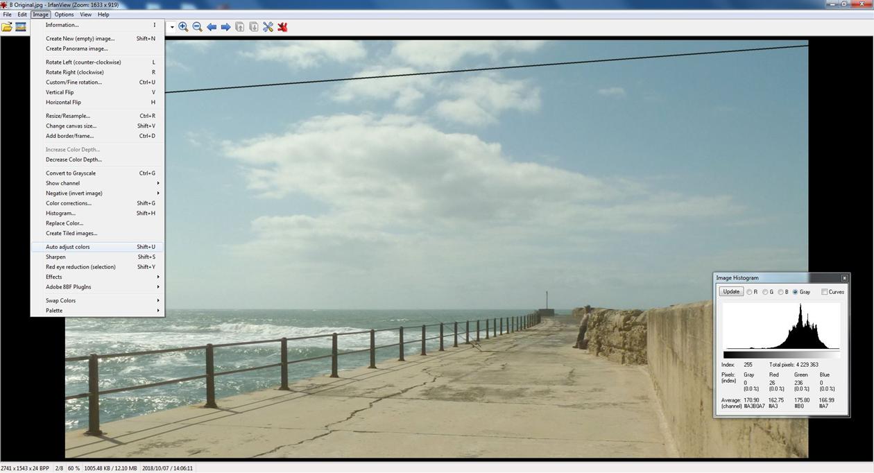
Image 7. The histogram
You will observe that the histogram is clumped together and shifted to the right, an indication that the image is of low contrast and rather bright. From this point there are several options. One is to try the ‘Auto adjust colours’ feature. Often the auto adjust works well but sometimes the result is ghastly. Fortunately with IrfanView you can always go back one step (using the curved back arrow in the icons at the top of the screen). If you really mess things up you can go ‘File – Reopen’ and start again. Note: if you want to save intermediate stages of your work, use a different name so you don’t overwrite the original – or work on a copy in the first place.
This is the result that auto adjust produced:
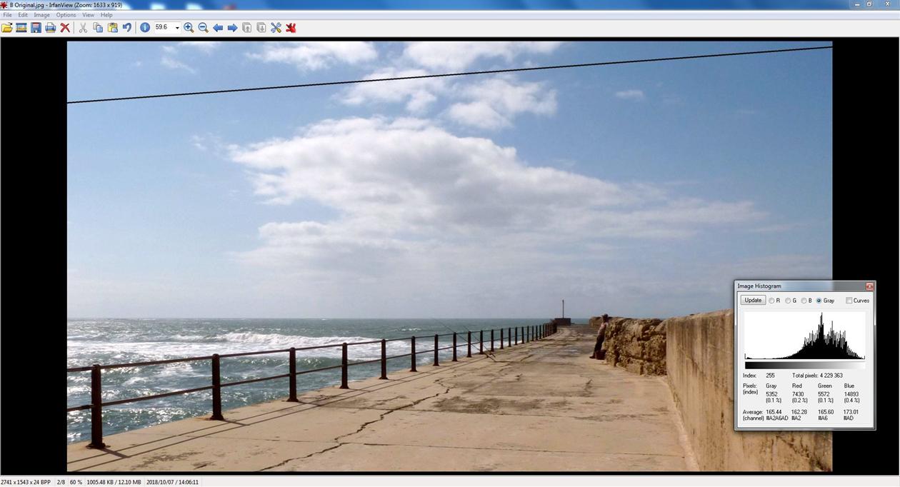
Image 8. After using ‘Auto adjust colors’
This is not too bad, and the updated histogram is more spread out because the auto adjust process has also increased the contrast. If you would prefer to try your own hand at adjusting contrast, hue and brightness etc., use ‘Image – Color corrections...’ to get to the following screen.

Image 9. The Color corrections screen
Now you can play to your heart’s content, and the best way to learn what everything does is to try it out. Tip: a quick way to set the white balance is to just click on something white in the left hand image e.g, the white cloud. The RGB sliders will then show the correction applied to the right hand image. Try experimenting with the gamma correction slider – it has the effect of brightening a dark area and revealing more detail there without bleaching out the bright areas, or vice versa. The function of other sliders is fairly obvious.
Step 4. Resizing for a full HD screen
The image is still 2741 by 1543 pixels which is more than the full HD 1920 by 1080 pixels, so we now need to resize the image. Use ‘Image – Resize/Resample’ and set the size to 1920 x 1080 pixels.
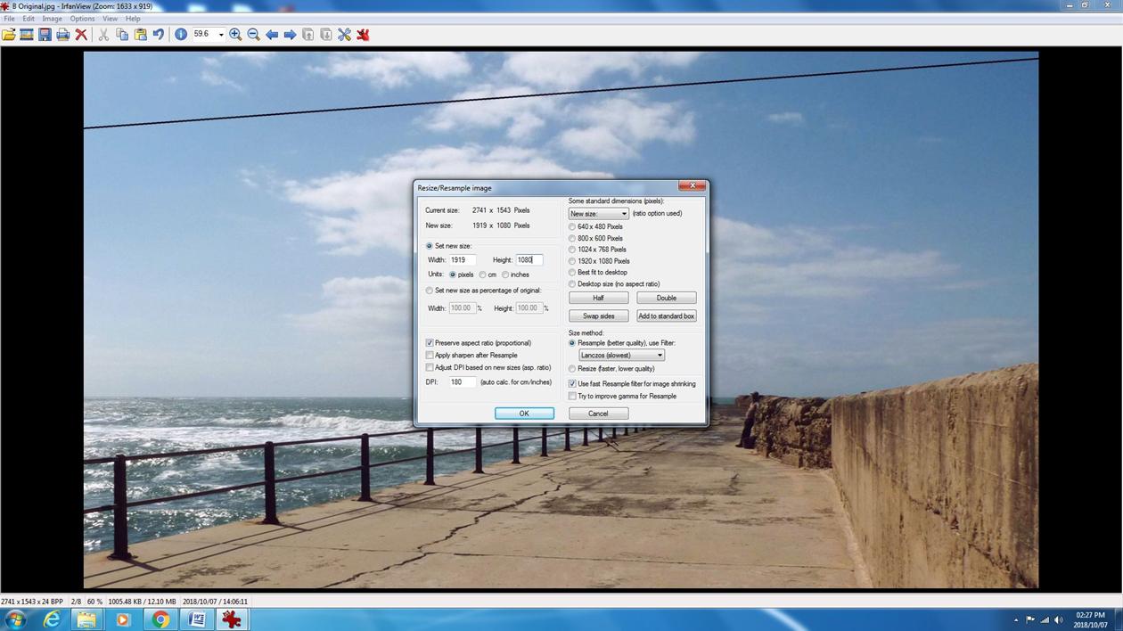
Image 10. Resizing for full HD
Why full HD? Unless you are planning to print the image, in which case you need all the pixels you can get, chances are the final image will be viewed on a screen that is at most full HD resolution. If your image has more pixels than that it will be downsized when it is displayed anyway and all you are doing is slowing down your computer with a big file and wasting disk space. Sizing your images for full HD means that they will typically occupy from 300 to 600 KB as a JPEG file on your hard drive, which will make them efficient to store, quick to load and practical to send electronically without losing any detail.
Step 5. Removing unwanted features
Now let’s deal with the wire across the sky. For this I use the clone tool in ‘Edit – Show paint dialog’. This tool copies a circular patch from one part of the image to another. To remove the wire, copy an area of the image with about the same colour and hue as the sky behind the wire – usually about the same distance above the horizon. The copy-from point and copy-to point move together so you can hold down the mouse button and just wipe the wire away! It takes a bit of practice and is easier when the background is uniform, such as plain blue sky. It is also helpful to enlarge the bit of image you are working on with the ‘+’ button. You can set the size of the copy patch which needs to be only slightly wider than the wire. My first attempt is shown below.
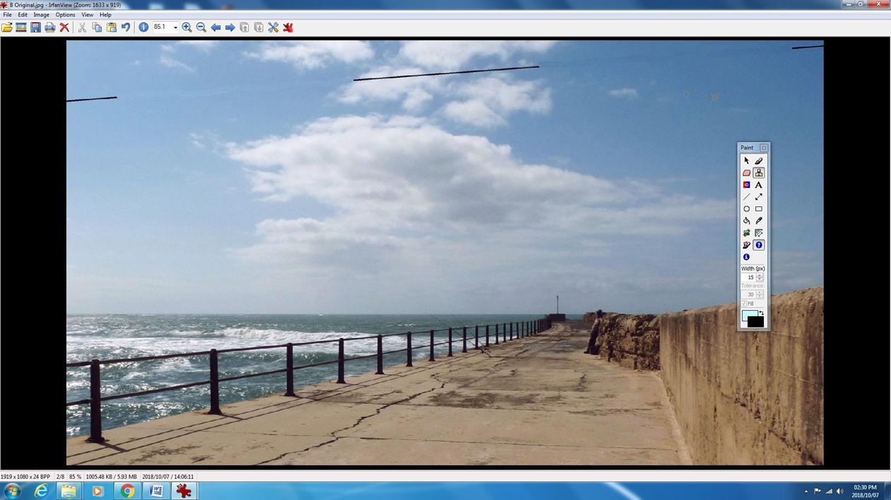
Image 11. The telephone wire partially removed
It’s not particularly good and I went back and tried again but this should give you the idea. It’s more difficult where the wire crosses the cloud and I never quite got it exactly right – but unless you know where to look, I don’t think it is noticeable.
Image 12. Imperfect removal of the telephone wire where it crosses the cloud
Step 5. Embellishing the image
This step is an optional extra but let’s add a bit of text for fun. You will find the text tool in the ‘Paint dialog’, and a wide choice of fonts, text size and colours are available. There is also a text tool in ‘Edit – Insert text...’ which is slightly different and has more features. With this tool you can even add text to a batch of images all at once. I find it a good idea to save my work before adding text or arrows etc. in case I want to start this part of the process again. Bear in mind, thought, that IrfanView only allows you to go back one step – to go back further you have to reload a previously saved image.
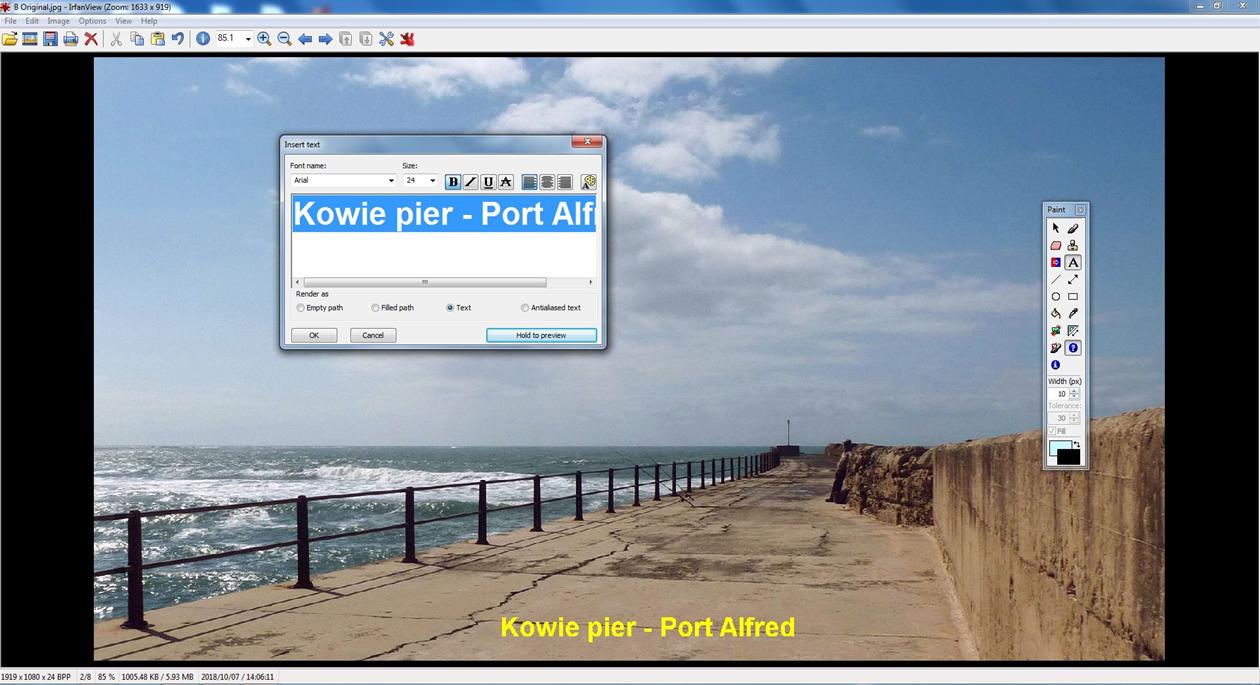
Image 13. Adding some text
SUMMARY
Just to remind you, here’s what we started with. The original file occupied 0.98 MB on my hard drive.
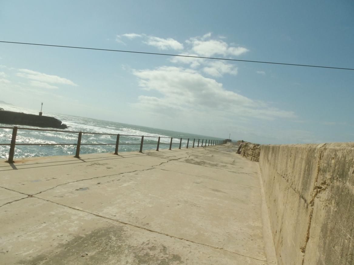
Image 14. The original image
And here is the final result. The file now occupies only 287 KB on my hard drive.
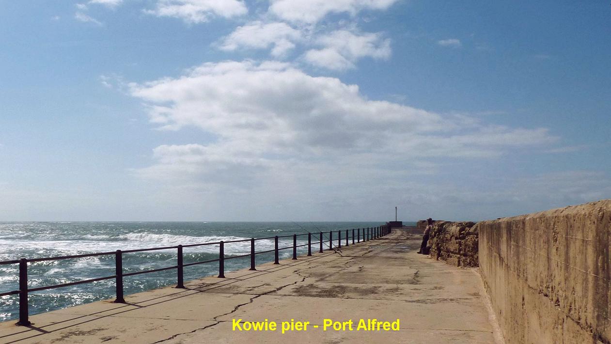
Image 15. The final image
OK, so it’s not going to win a Pulitzer Prize, but but I hope you agree it has come a long way. The focus is a bit soft because the cropping was quite harsh and the camera I used was a small compact ‘point and shoot’. I did add one level of sharpening from ‘Image – Sharpen’ which made it a bit crisper but I caution against using this function more than once. If you oversharpen, the image starts to look grainy with fringes at the edges of objects and here it also sharpens the less-than-perfect obliteration of the wire where it crossed the cloud. Furthermore, if you intend to displaying sharpened images on a modern TV screen from your flashstick, note that many TV screens add a sharpen of their own so you might start to see graininess and fringes that you won’t see on your computer screen.
In conclusion
I hope this article will encourage you to select a few of your own holiday snapshots, to try some image processing and use the results to really impress your friends. IrfanView is immensely powerful despite its small size and I have barely scratched the surface of its capabilities. No doubt you will soon accumulate your own repertoire of useful techniques to turn your “happy snappies” into attention grabbing images. Go for it!
Finally, here is a list some of the things I think about when taking a picture and later when I process it. It’s my little bag of personal tricks –many are well known but worth repeating.